
Tiny House: IoT & PropTech
Product Strategy & Design
4 Weeks
Multi-Device (Mobile, Tablet, TV)
A multi-device architecture for micro-living. Transforming chaotic design into a synchronized IoT workflow that reduces Cognitive Load and ensures purchase certainty.
Product Strategy
IoT
VR Integration
Complex System UX
The Challenge
Designing a 37sqm micro-home is a psychological challenge. Standard 2D blueprints fail to convey true spatial volume, creating decision paralysis and deep purchase anxiety.
The Friction of Collaboration
On paper, a 10cm difference seems negligible; in reality, it distinguishes a home from a holding cell. This spatial ambiguity fuels the IKEA Argument syndrome.
In most couples, one partner is more Technical while the other is more Creative. Existing tools force them to crowd around one screen, creating conflict. We engineered an Ecosystem that separates forces to connect people, understanding that every device (and person) needs a distinct role.

Prototyping & Refinement
A multi-device ecosystem lives or dies by its interaction logic. We didn't rely on static mockups; we built a high-fidelity prototype to stress-test the latency and the "hand-off" experience between devices in real-time.
The Remote Control Fallacy
Our initial hypothesis assumed users would want to control the design directly from the TV. However, early prototyping revealed that navigating complex UI menus with a standard TV remote created immense friction and cognitive fatigue. We iterated immediately, shifting the mental model: The TV became a View Port, while all complex inputs were offloaded to the touch devices. This pivot significantly smoothed the user journey.
Device Hand-off
Ensuring seamless context switching when moving from Mobile (Budget) to Tablet (Design)
Spatial Orientation
Using the TV as a fixed "North Star" to prevent users from getting lost in the 3D space
Latency Management
Simplifying visual assets to ensure real-time syncing across devices without lag

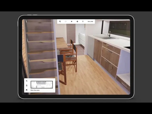
The Tablet functions as a creative canvas, enabling precision placement of furniture within a seamless and synchronized IoT workflow.

The TV serves as the shared North Star, mirroring real-time design changes to keep both partners synchronized and connected.
The Logic & Solution
Instead of forcing every feature into every screen (Standard Responsive Design), we engineered a role-based architecture. We treated each device not just as a screen, but as a specialized team member with a distinct job.
The Distributed Responsibility Matrix
01: Mobile (The Executor)
Designated for the technical partner. This is where budget, dimensions, and procurement are managed. We moved these here because catalog filtering requires linear focus, not a broad creative canvas.
02: Tablet (The Canvas)
Designated for the creative partner. This is the breathing workspace for Drag & Drop, texture placement, and fine-tuning the layout without logistical distractions.
03: TV (The North Star)
The friction solver. It serves as a shared display with Mode Switching capabilities (Blueprints / 3D / VR / Split View). Instead of flipping the iPad around to show your partner what you did, changes sync in real-time to the big screen, keeping both partners in the same context.
Strategic Pivot
Following the prototyping phase, we officially "killed" the TV purchasing option. This decision sharpened the product definition and reduced unnecessary development complexity, aligning with the View Only strategy.
Results & Impact
While this Tiny House project is a concept MVP, our rigorous high-fidelity prototyping and user simulations allowed us to project key performance metrics based on workflow efficiency and comparative analysis with existing market tools.
0%
0%
Faster Consensus
Estimated reduction in time-to-decision for couples
0
0
Unified Touchpoints
Seamlessly synchronized Mobile, Tablet, and TV into a unified state, preserving user context and data integrity
0°
0°
Spatial Validation
Unlike 2D plans, the VR mode covers every angle, eliminating blind spots and verifying flow before construction begins
More Works
©2026


FAQ
01
How long does it take to design an MVP?
02
Can design help me raise seed funding?
03
Do you handle the development/coding?
04
What do I need to provide to get started?
05
Why custom design over a generic template?
06
Do I own the designs and IP?
07
What if we need changes after the launch?
08
Do you work with existing branding?
Tiny House: IoT & PropTech
Product Strategy & Design
4 Weeks
Multi-Device (Mobile, Tablet, TV)
A multi-device architecture for micro-living. Transforming chaotic design into a synchronized IoT workflow that reduces Cognitive Load and ensures purchase certainty.
Product Strategy
IoT
VR Integration
Complex System UX
The Challenge
Designing a 37sqm micro-home is a psychological challenge. Standard 2D blueprints fail to convey true spatial volume, creating decision paralysis and deep purchase anxiety.
The Friction of Collaboration
On paper, a 10cm difference seems negligible; in reality, it distinguishes a home from a holding cell. This spatial ambiguity fuels the IKEA Argument syndrome.
In most couples, one partner is more Technical while the other is more Creative. Existing tools force them to crowd around one screen, creating conflict. We engineered an Ecosystem that separates forces to connect people, understanding that every device (and person) needs a distinct role.
Prototyping & Refinement
A multi-device ecosystem lives or dies by its interaction logic. We didn't rely on static mockups; we built a high-fidelity prototype to stress-test the latency and the "hand-off" experience between devices in real-time.
The Remote Control Fallacy
Our initial hypothesis assumed users would want to control the design directly from the TV. However, early prototyping revealed that navigating complex UI menus with a standard TV remote created immense friction and cognitive fatigue. We iterated immediately, shifting the mental model: The TV became a View Port, while all complex inputs were offloaded to the touch devices. This pivot significantly smoothed the user journey.
Device Hand-off
Ensuring seamless context switching when moving from Mobile (Budget) to Tablet (Design)
Spatial Orientation
Using the TV as a fixed "North Star" to prevent users from getting lost in the 3D space
Latency Management
Simplifying visual assets to ensure real-time syncing across devices without lag
The Tablet functions as a creative canvas, enabling precision placement of furniture within a seamless and synchronized IoT workflow.
The TV serves as the shared North Star, mirroring real-time design changes to keep both partners synchronized and connected.
The Logic & Solution
Instead of forcing every feature into every screen (Standard Responsive Design), we engineered a role-based architecture. We treated each device not just as a screen, but as a specialized team member with a distinct job.
The Distributed Responsibility Matrix
01: Mobile (The Executor)
Designated for the technical partner. This is where budget, dimensions, and procurement are managed. We moved these here because catalog filtering requires linear focus, not a broad creative canvas.
02: Tablet (The Canvas)
Designated for the creative partner. This is the breathing workspace for Drag & Drop, texture placement, and fine-tuning the layout without logistical distractions.
03: TV (The North Star)
The friction solver. It serves as a shared display with Mode Switching capabilities (Blueprints / 3D / VR / Split View). Instead of flipping the iPad around to show your partner what you did, changes sync in real-time to the big screen, keeping both partners in the same context.
Strategic Pivot
Following the prototyping phase, we officially "killed" the TV purchasing option. This decision sharpened the product definition and reduced unnecessary development complexity, aligning with the View Only strategy.
Results & Impact
While this Tiny House project is a concept MVP, our rigorous high-fidelity prototyping and user simulations allowed us to project key performance metrics based on workflow efficiency and comparative analysis with existing market tools.
0%
0%
Faster Consensus
Estimated reduction in time-to-decision for couples
0
0
Unified Touchpoints
Seamlessly synchronized Mobile, Tablet, and TV into a unified state, preserving user context and data integrity
0°
0°
Spatial Validation
Unlike 2D plans, the VR mode covers every angle, eliminating blind spots and verifying flow before construction begins
More Works
©2026
FAQ
How long does it take to design an MVP?
Can design help me raise seed funding?
Do you handle the development/coding?
What do I need to provide to get started?
Why custom design over a generic template?
Do I own the designs and IP?
What if we need changes after the launch?
Do you work with existing branding?